Community members who share their stories also provide us with information about what those stories mean to them. They interpret their own story by responding to follow-up questions called “signifiers.”
To summarize how hundreds of community members interpreted their own stories, their responses are presented visually in special charts and graphs.
When community leaders and decision makers view these data visuals, they gain insight into the community. They are able to better understand what residents’ stories mean for them and what may be needed to fill the future with more positive stories.
Two Types of Visuals
There are two types of data visuals which correspond to the two types of signifiers, or special follow-up questions, used by Palm Health Foundation. These are called dyads and triads. The word “dyad” means that there are two options, and “triad” (like tricycle) indicates three options.
Questions with Two Options (Dyads)
Here is an example of a dyad. To respond, the storyteller moves the bubble to show how “stressed out” or “calm” they feel in their story. If the bubble remains close to the middle, this means that they are not too “stressed out” or “calm” in their story. They’re somewhere in the middle.

To summarize how storytellers responded to a dyad question, we use a bar graph (specifically, a histogram) like the one below:
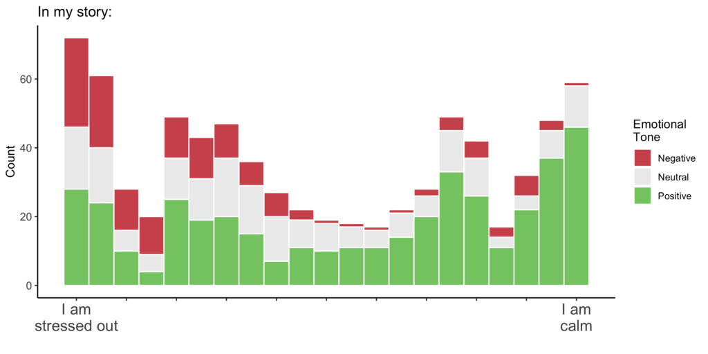
Each histogram shows all of the responses (of all the storytellers) to one of the dyad questions. The height of the bars represents counts. Taller bars mean that more people moved their bubble to that spot on the continuum. Short bars mean that only a few people moved their bubble to that spot.
Questions with Three Options (Triads)
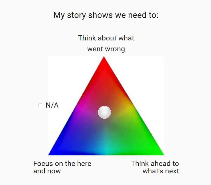
Here is an example of a triad. To respond, the storyteller moves the bubble to show how much each option applies to their story. If they leave the bubble in the middle, each option applies equally to their story.
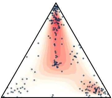
To summarize how storytellers responded to a triad question, we use a special visual called a ternary plot.

Each dot on the triangles shows where one person moved their response bubble on the triad (triangle question). Importantly, if someone moved the bubble to the middle, it means that they felt each option applied equally to their story.
The colored gradient simply shows where there are more dots (responses). Darker or brighter colors show that more people moved their response bubble to that area of the triangle. Each ternary plot shows all of the responses to one of the triad questions.
Exploring the Visuals: What to Look For
As you explore the data visuals, what patterns do you notice? Do the patterns fit your expectations? Or do you see patterns you did not expect?
In addition to noticing the big trends, look for small groups of responses separate from the rest. These small clusters might show what is possible for the community, for better or worse. They can also lead to unexpected insights.
After you view the visuals, you can search for stories based on how residents responded to the question. For example, a small group of storytellers shared that their story shows we need to “think about what went wrong.” You can perform a search (using the search and filter page) and find the stories that were interpreted in this way. What happens in these stories? What are the stories about?